
Branding
Madre Cepa
- Client
- Madre Cepa
- Industry
- Wine
- Services
- Brand Identity
Wordmark
Illustration
Label Design
Social Content
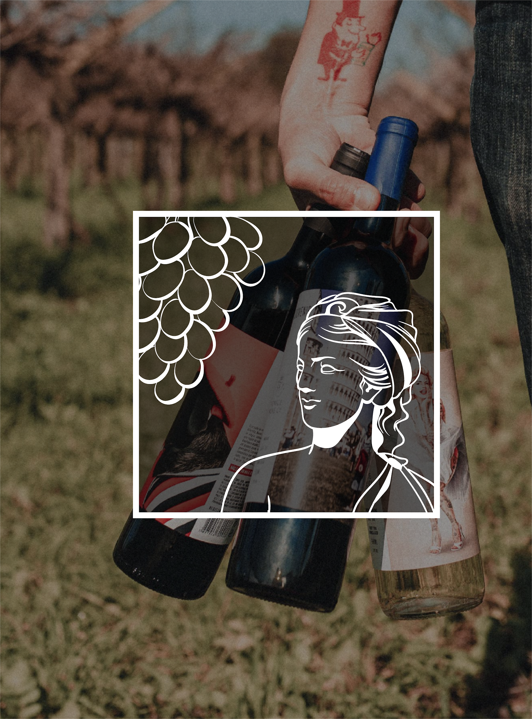
Madre Cepa means mother vine, and the brand is built on that idea: wine that starts with old vines, patient work and people who care about the land. They wanted something classic enough for a wine shelf, but with a story you can see.
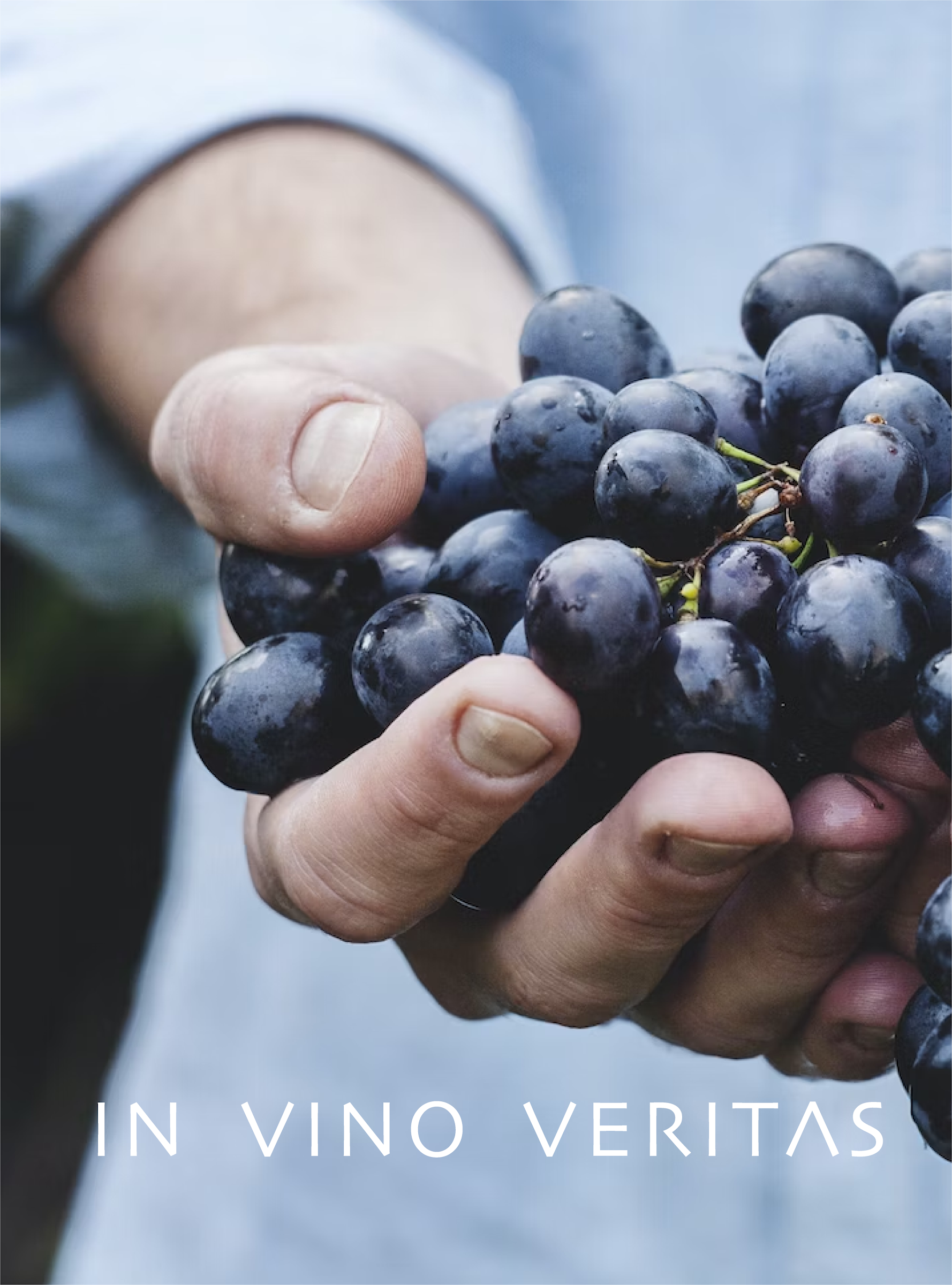
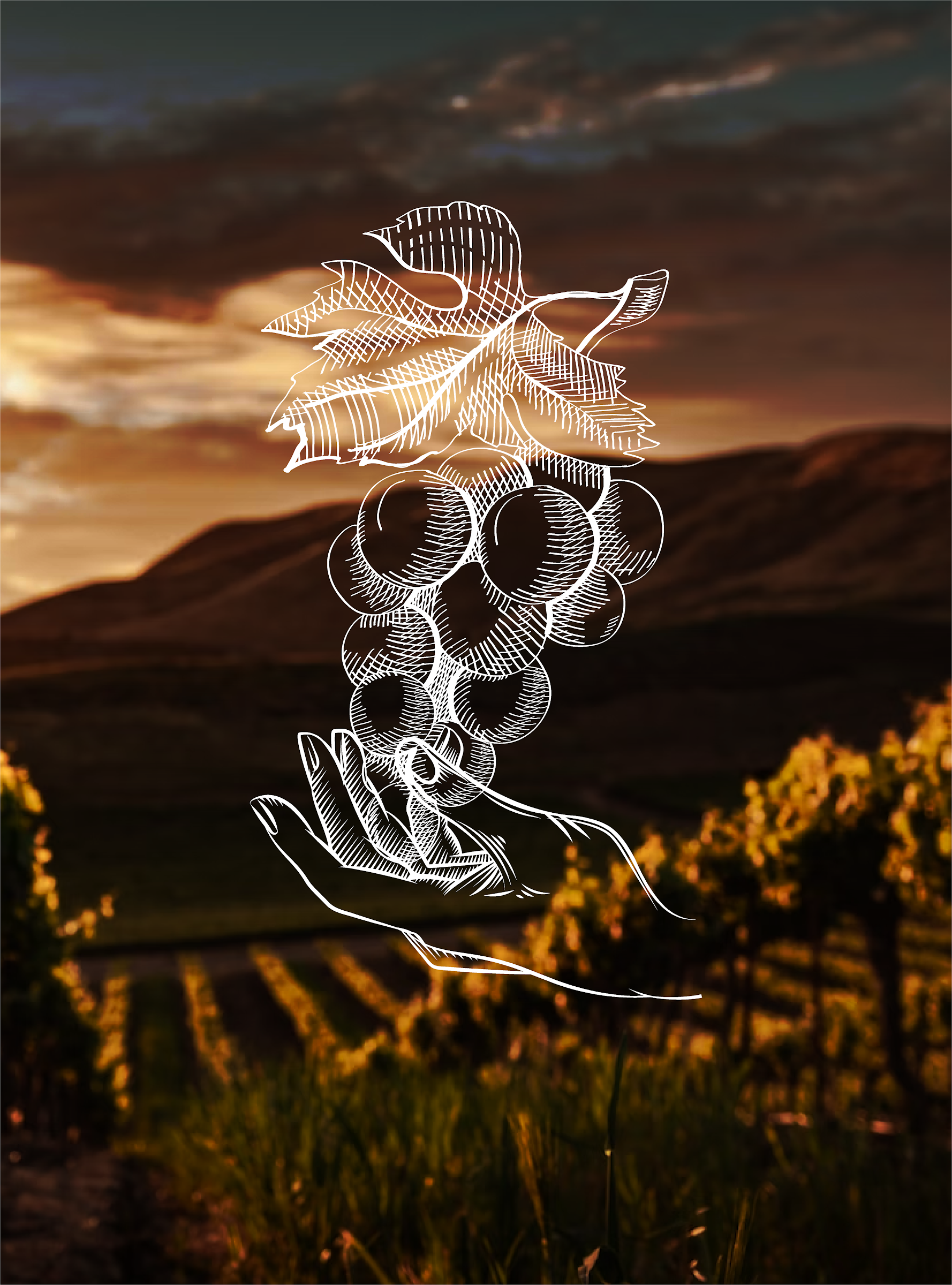
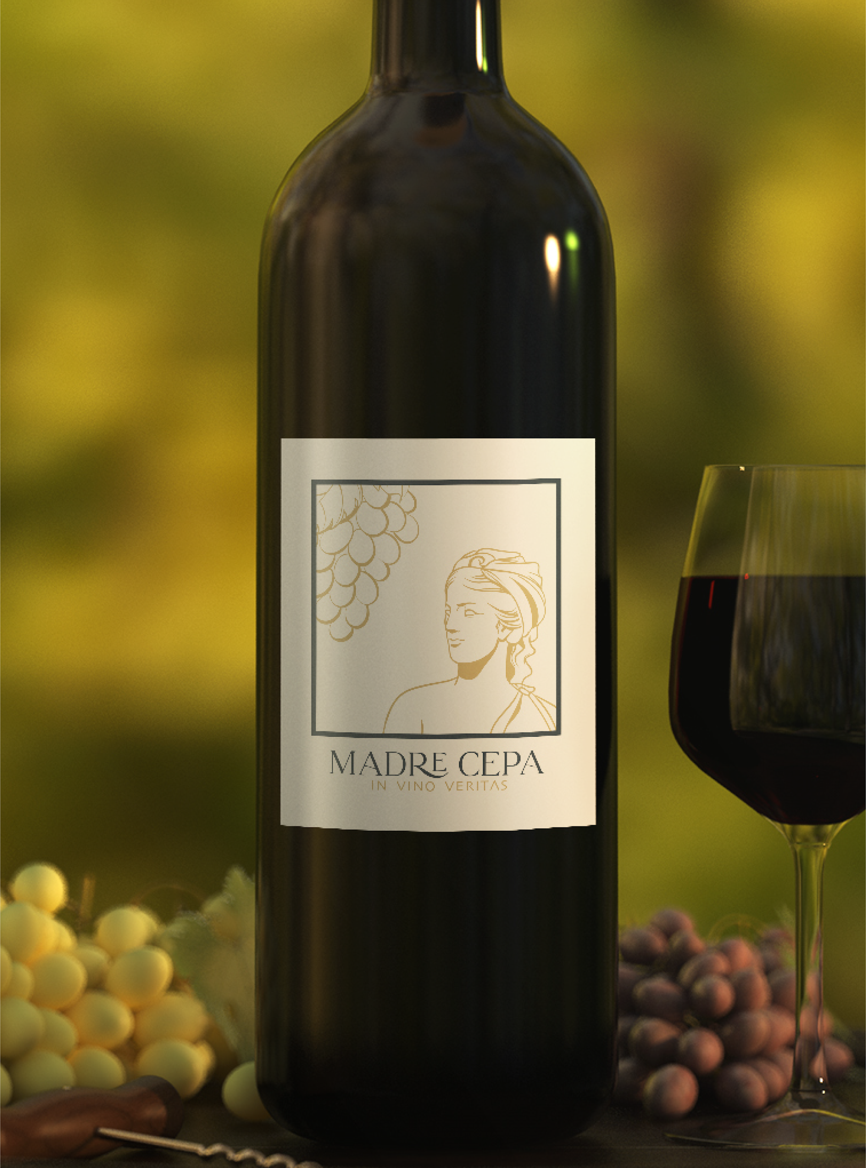
We set a refined MADRE CEPA wordmark with the line in vino veritas, then drew a fine-line illustration of a hand holding a grape cluster that grows into a vine. It sits on the bottle label, in vineyard photography and across social, so every piece connects back to the vine.
Next
Building a brand that needs to look the part?
SOFIA is a creative and performance marketing studio in Bend, Oregon, working with brands across the US and worldwide on identity, Shopify builds, content and paid media.